Ticket reports allow you to monitor and analyze the handling processes and categorization of tickets in your organization. They can be customized to display data based on specific criteria, such as “ticket equals a particular type of ticket.” This makes it possible to generate a report showing only tickets belonging to a selected category, making it easier to focus on a specific segment of tickets. By setting the report to tickets “equal to” the “Incident” type, you get a listing of only tickets classified as “Incident”. This allows efficient management of tickets and monitoring of handling processes within the category.
More about tickets: Go >
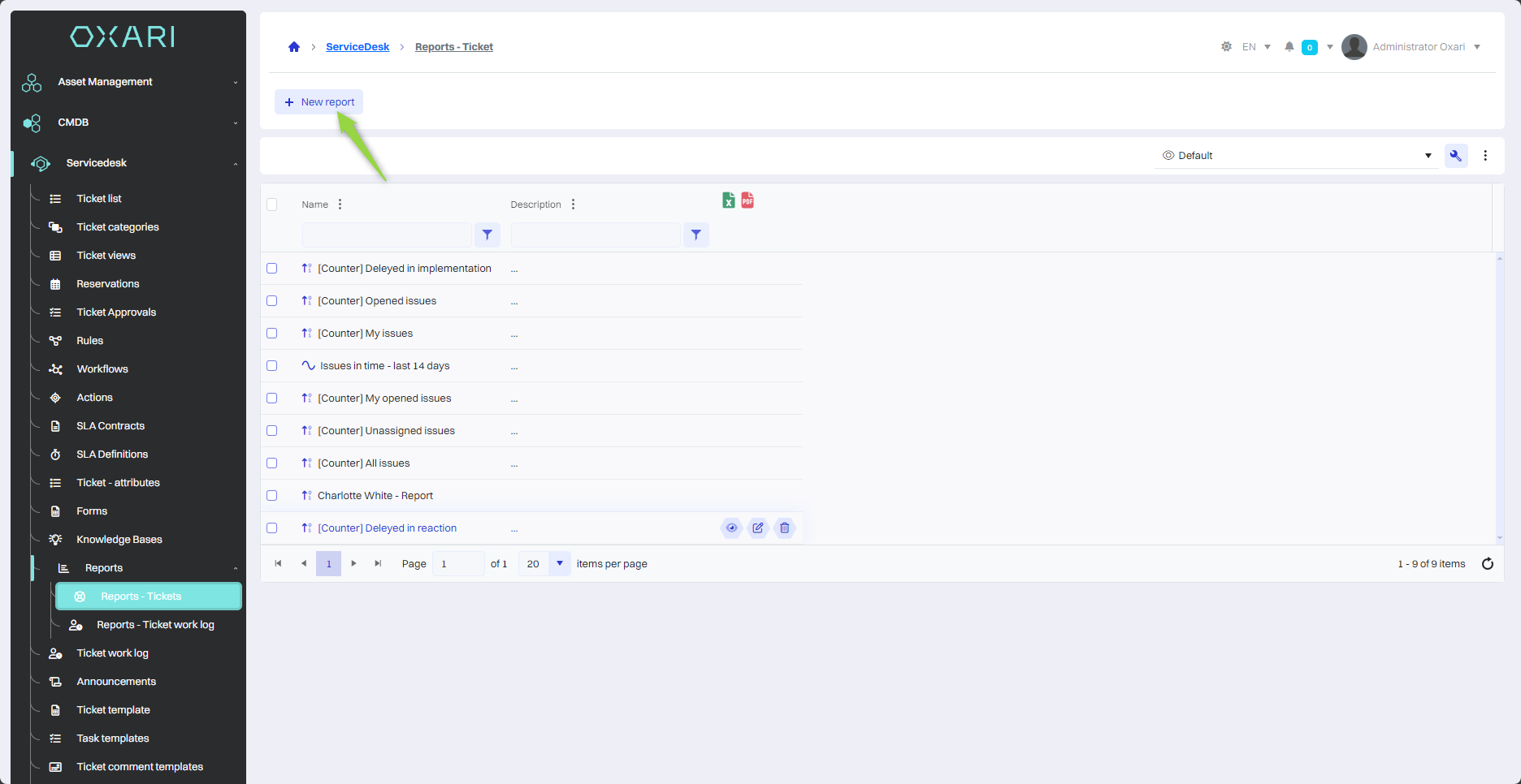
New report
To add a new report, go to Servicedesk > Reports - Tickets, and then click the “New report” button.
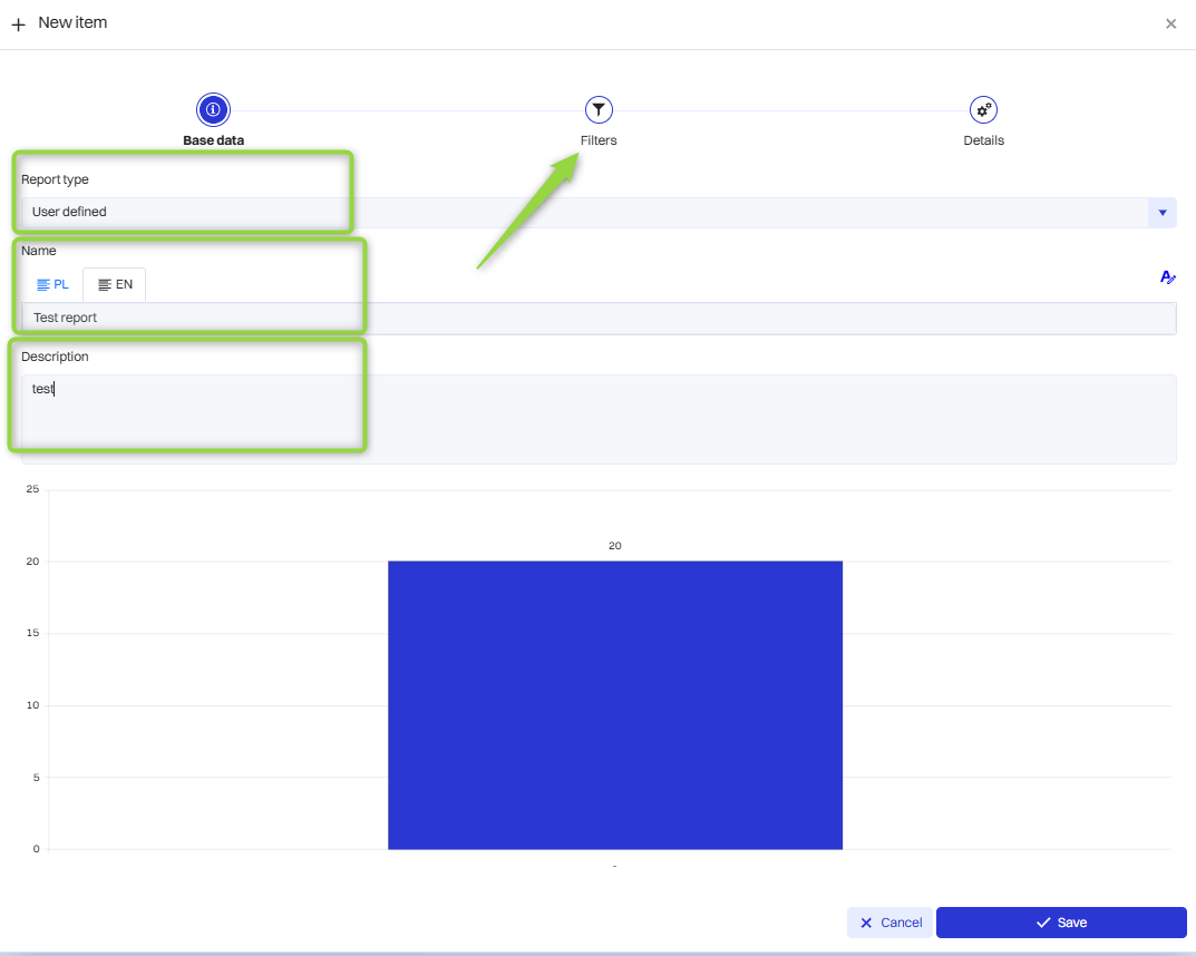
Filling in the basic data
In this step, the basic data are filled in, the Report type is selected, the report is named and described, then click the “Next” button.
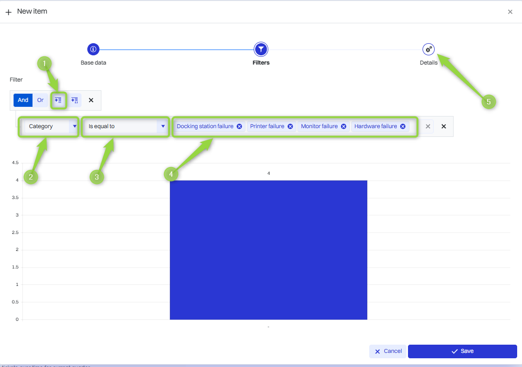
Setting the report filters
In this step, the report filters are established.
1. Click the “Add expression” button
2. Click in the field to set the filter (in this case “Category”).
3. The operator is selected (in this case “Equal”)
4. The model in question is selected (in this case “Equipment failure”).
5. The “Details” button must be clicked.
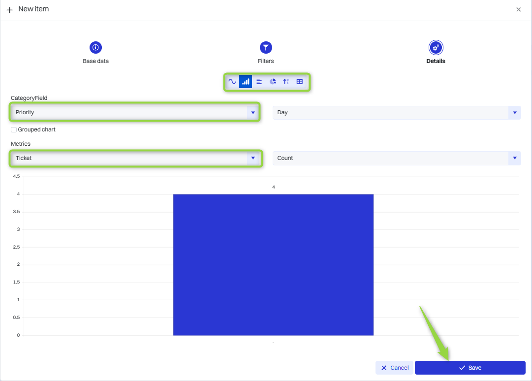
Determine the details of the report
In this section, you can select the data category, metric and chart type. Reports in OXARI can be presented in a variety of data visualization formats, depending on your analysis and information presentation needs. The available formats are: Line chart, Column chart, Bar chart, Pie chart, Count, Tabular. Select the desired data and click the “Save” button.
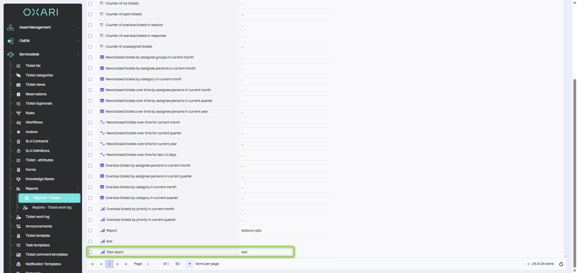
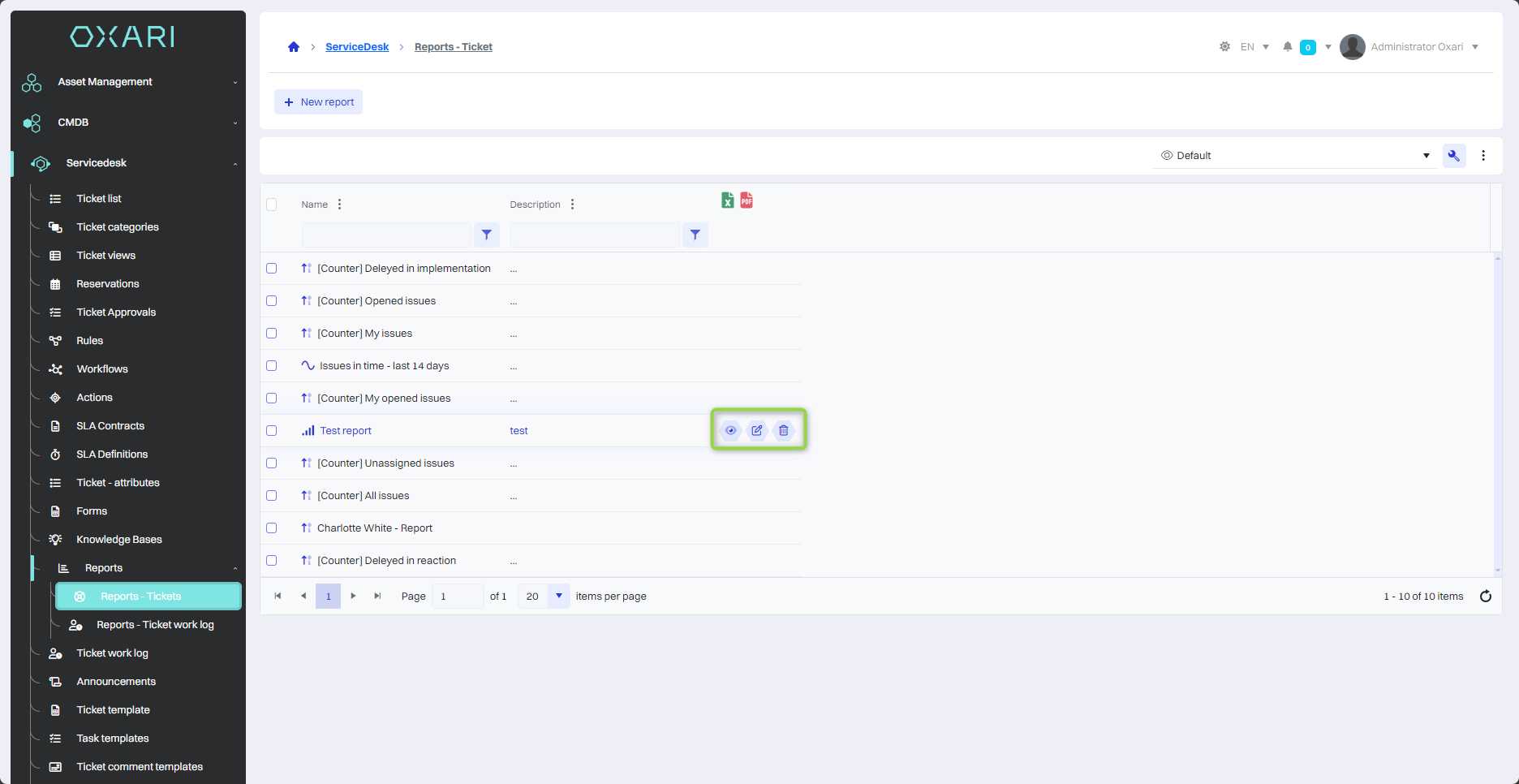
After saving, the report appears in the Reports - Tickets table:
Showing, editing/deleting a report
The report can be displayed, edited and deleted using the following buttons.
Adding a report to the dashboard
Reports can be displayed on the dashboard.
The process is described here: Go >